When choosing a professional headshot, most people focus on the obvious details: expression, lighting, clothing, and background. But there’s another element that can have a significant impact on the final photograph: the space around the person.
In photography, this is often called negative space. It refers to the areas of the image that aren’t occupied by the main subject. While it might look like empty space, it serves a purpose. It helps direct attention, creates balance, and gives the photograph room to work in different settings.

Giving the Subject Room to Stand Out
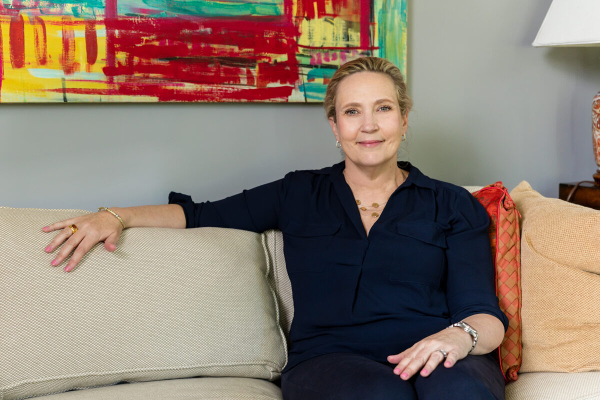
A well-composed headshot doesn’t always need to place someone directly in the center of the frame. Positioning a person slightly to one side can create a more open composition, allowing the surrounding space to become part of the image. This doesn’t take attention away from the subject. In fact, it can help draw the viewer’s eye toward the person while giving the photograph a more natural sense of balance. The right amount of negative space also prevents an image from feeling crowded. Every element has room to breathe, and the person remains the clear focal point.
Making Room for Design and Text
Professional photographs often need to fit into layouts that extend beyond a simple profile picture. A company website might use a portrait alongside an introduction, while a speaker page may combine a photograph with a biography and event details. In these situations, negative space becomes particularly useful. A photograph with room on one side can accommodate text or graphic elements without covering the subject or making the layout feel cramped. The same principle applies to website banners, promotional materials, presentations, and other business communications. A thoughtfully composed photograph offers more flexibility to the people using it.
One Photograph, Different Applications
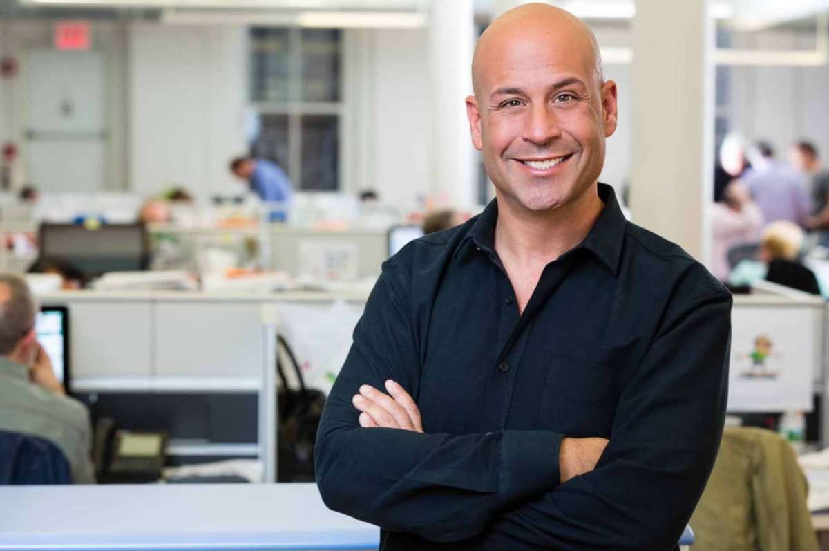
Composition can also influence how easily a photograph can be adapted for different formats. A tightly framed headshot may be ideal for a professional profile, but it might not offer enough flexibility for a wider website layout. A portrait with more space around the subject can sometimes be cropped or positioned in different ways while preserving the overall composition.
This doesn’t mean every photograph needs to be wide or leave large areas of empty background. The framing should always suit the person and the intended use. The goal is to create options without compromising the photograph itself.
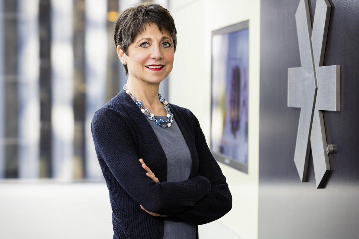
It’s About What You Leave in the Frame
Negative space isn’t simply unused background. It’s an intentional part of the composition that influences how a photograph looks and where it can be used. When planning a professional headshot session, thinking about framing and the space around the subject can make a meaningful difference. Sometimes, giving a photograph a little more room is exactly what makes it more useful.
Looking for professional headshots? Visit our galleries to see different approaches to professional portrait photography, and contact us to discuss the kind of images you need.
Stay connected with us:
Follow us on Instagram, LinkedIn, and Facebook

Brett Deutsch is co-owner and chief photographer of Headshots NYC, Gotham Family Photos and Deutsch Photography. Formally trained at the New York Institute of Photography, the School of Visual Arts and Pomona College, plus nearly 20 years of photography in New York City and on all 7 continents. His work can be found on The New York Times. Time Out London. Dallas Morning News. Backstage, and on countless websites, newsletters, annual reports and other publications.